One that makes it Whole and then Some!
They say to always open with a joke, but there’s no subtle way to say this: it took us more time to complete our rebranding than it did for us to acquire 18 million users. Funny (or hurtful, depending on who’s reading it) as it sounds, we’re more confident that if we are to go back and acquire the same 18 million users with this spanking-new look, it’d take us probably half of what it took originally.
Because India’s most beloved crypto brand now looks much younger, cleaner and fresher. To put it in Gen Z terms, we went from a 6 to a 9. All hail the tireless efforts of our resilient brand crew, patient leaders, supremely talented tech and product crew and the ever-great agency Animal. Hail!!!
Were we really a 6 though?
We know what you’re thinking, “for a brand so beloved, we were pretty blue all the time”. See, the CoinSwitch “blue” will go down in history as one of the warmest colors in an industry so cold. That blue wasn’t born out of a long-term vision, but a short-term need. A need to have “something, so we can start.” Akin to every other startup’s genesis story, we saw an opportunity, and we set out to grab it. We didn’t care how we looked, what we were wearing or how we were coming across. . . well, until much later. We just wanted to make crypto accessible, affordable and attainable for Indians, so forgive us if our clothes weren’t laundered, Karen!
Why the change now? Because ‘Timing the Market’
Contrary to what our social media crew thinks, we didn’t do away with our blue to separate ourselves from Twitter’s ongoing blue war. In fact, our rebranding efforts started as early as April 2021. We’ve always envisioned a future for CoinSwitch that is more than crypto. The first product in our shop may have been crypto but we knew where we wanted to be all along. Since the beginning of our rebranding exercise and now, we’ve been through countless iterations of the logo, multiple catch ups to agree on new colors and far too many untimely regroupings on “naye illustrations mein maza nahi aa raha”. But as unlikely as it may seem, through all this chaos, one thing remained constant; our brief to the agency:
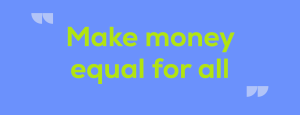
CoinSwitch’s vision from the start has been to make money equal for all. We’re not talking about bridging the net worth between the world’s richest dude in India and that 9-5er in the city of Bangalore. We’re talking about a vision where money and investment opportunities are made accessible, affordable and achievable for everyone. For people from the colorful streets of Banaras to the high-rise dwellers in Hyderabad; from your go-to chaiwaala across the street to your chartered accountant; from your parents to your door ke rishtedaar; everyone has equal opportunity and access to investing and building wealth. Clearly a bold and audacious plan like this needed a revamp and we strongly believe we’ve achieved that.
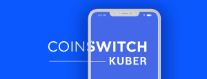
Presenting A Brand New CoinSwitch
Say hi to CoinSwitch that’ll revolutionize the financial investment journey for Indians.
The new CoinSwitch represents our way forward: becoming a wise, friendly, no-nonsense wealth-tech destination for investments. Our revamped visual identity was born from our ethos and years of interaction and serving you. CoinSwitch is perceived as a friendly neighborhood app that makes crypto investments and life easy for everyone. We’re carrying forward that same humble mission and packing it in new vibrant shades and young colors giving that friendly neighborhood app, a more appropriate contemporary look – one that resonates more strongly with our vision, our plans and of course, you!
“Log-o kya kahenge?”
Logo ka kaam hai kehna!
Our new logo is built on that idea of choices and a diverse portfolio. Every portfolio is unique. Each portfolio is a composition of different dreams, plans, financial goals and aspirations and of course different portfolios. Some big, some small; some permanent, some dynamic; some personal, some even more personal. Every portfolio is a reflection of its user. The different shapes in varying sizes and colors are used to convey these values and showcase how every user’s financial journey is different but CoinSwitch accommodates them all. The structure is given to these forms as they compose a C-shaped mnemonic.

“You have a sophisticated color palette”
This was an early Christmas gift to our designers. We were starting to get a keen sense that our designers were starting to feel a little too blue all the time. Quite literally too, when you extend the logic to designs. So, no more “color me blue” for creative briefs.
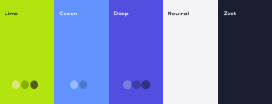
As we transition from a single-asset app to a wealth-tech destination, we understand now more than ever, the need for a stronger relatable visual personality. In light of that, we’ve adopted a more colorful, contemporary but sophisticated color palette that strongly highlights our culture, our audience and our brand. The result is a deep purple, complemented by darker and lighter blue tones juxtaposed with a bold, zesty lime. A soothing mix of colors that articulates the brand’s personality and enhances the visual appeal of the product. Designers are the most finicky species on the planet, so when everyone from our design tribe rejoiced in unison, it was a testimony that we were marching in the right direction.
“A complementary secondary palette to go, please”
Our revamped band of colors perfectly capture our renewed CoinSwitch spirit. We’ll tell you why!

As a fintech company, we’re ever-evolving. Making financial investments aspirational is one side of the coin; the other is using the platform to educate, inform and engage before they make a decision. This is where our new secondary range of warm but bright colors will assist our primary palette. The dash of pink, muted lush of light green, and aesthetically bleached shades of blues and purple pop will bring our illustrations and other product creatives to life. They’re what, we believe, will bridge the gap between “maza nahi aa raha!” and “yeh hui na baat!”.
A large part of the conversations and communications going forward would be more refined and humanized while retaining that tinge of humor that’s always set us apart in this industry.
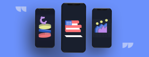
“Allow us to demonstrate illustrate”
There’s a very distinctive character assigned to CoinSwitch now. We wouldn’t call it a mascot, but the petition is still doing rounds though.
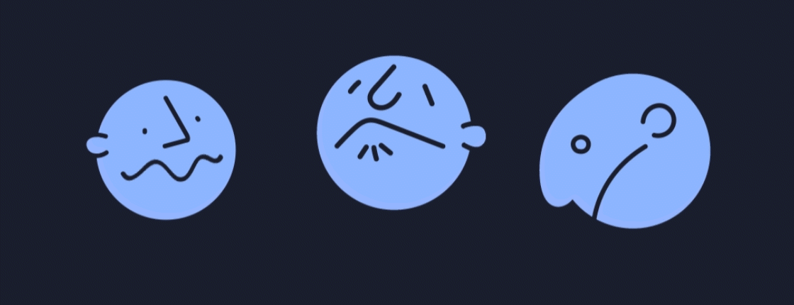
Our new illustrations are derived from one of our many core mottos – simplicity and inclusion. The character and the philosophy behind our new range of illustrations are to show the diversity that’s prevalent in the market and in our pool of consumers. Both possess a mind of their own and our illustrations attempt to recreate that perspective and mood. By using modularity through an expansive set of options, the faces, bodies, attires and items can be switched to create new combinations of people, situations and actions. With distinct features and subtle traits, these characters are hand-drawn with a fluid line movement, made to be imperfectly smooth.
If you look closely, you’ll see each feature is a shape that’s been twisted, turned or stretched to birth expressions. What really brings character to these characters is the carefully exaggerated lines and colors when creating them.

We heard someone say, “CoinSwitch’s new characters are not drawn, they are assembled”. Rightly so!
“Bro, Nexa-level Fontastic Writing Style”
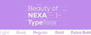
What’s the worst font you’ve ever seen and why is it Comic Sans? Kidding. We’ve used it heavily in our early days. That was our idea of “off-beat”.
But now we use Nexa. A much crisper, cleaner and neater font that truly enhances the reading experience. So much so, we’re more and more tempted to keep this piece going. The Nexa family has helped us retain the same appeal and approachability projected by our original font. The thin evenly separated letters give the brand’s visual identity a major lift through its minimal characteristic.
Way Forward & Beyond
“Dheere khelo, par lamba khelo!”
That Rahul Dravid batting philosophy is what our entire plan of action is.
For a crypto company that wants to make money equal for all, expanding to other investment products seemed like the natural next step. Thanks to you and 18 million other CoinSwitch users, we’ve realized that Indians love investing and cricket. Our aim by the end of next year is to become a holistic financial investment platform that allows Indians to understand and invest in multiple assets all in one place. This might sound outrageously ambitious, but what if we told you we’re halfway there already?
Over the last few weeks, we’ve released multiple assets options to a pool of users and the reviews are rave. We’d be officially launching it for the rest of the world soon, but not before our coders spend another couple of weeks hashing and squashing any leftover bugs.
One last note!
We were long overdue for a makeover from a product POV, tbh. Our new and improved look is an outcome of many sleepless nights, deep research, meticulous planning and stubborn dark circles. It was all worth it though. Over the next few weeks, you will see a more refreshed and charming CoinSwitch. It took a ton of effort from a lot of people to bring you our glow-up!
All of this couldn’t have been achieved, had it not been for the faith and trust in us. We’re really grateful to you for choosing us as your crypto partners and now as we expand to introduce India to new-age investments, we only hope you tag along.
See you on the app!