Every trader remembers that first time staring at a chart: a mess of colors, lines, and candles moving faster than thought. But those movements aren’t chaos. They’re coded emotion, fear, greed, hesitation, conviction, all plotted in asset prices. Once you learn how to read them, the noise fades, and rhythm appears. That’s what advanced chart patterns do: they turn raw data into language. Whether it’s gold advanced charts or crypto pairs like BTC/USDT, the skill stays the same. You read momentum. You sense reversals. You recognize opportunity before others do. Tools like RSI, SMA, EMA, and MACD aren’t just indicators; they convert price and volume data into signals that reflect the underlying market psychology.
Candlestick Charts
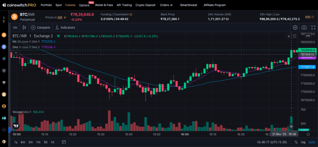
Every chart tells its story through candlesticks, and once you understand them, you’ll never look at prices the same way. Each candle shows what happened in a specific window; it opened somewhere, climbed high, dipped low, and closed somewhere else. That’s it. But inside that simplicity lies human psychology.
A long green candle? Buyers pushed hard and never looked back. A red candle with a long upper wick? Sellers fought back near the top. Patterns begin to whisper meaning, a hammer hints at recovery after panic, a shooting star warns of exhaustion after euphoria.
Look at Bitcoin trading near ₹1,03,00,000. When you see three strong green candles after a tight range, that’s momentum waking up. When those greens shrink and shadows grow, energy fades, something’s changing. These candles repeat across every chart, from Ethereum to gold. The difference is in how you interpret them.
Candlestick reading isn’t about memorizing patterns; it’s about catching the rhythm between buying pressure and selling relief. The chart becomes less of a graph and more of a heartbeat. You’re reading the crowd, not the coin.
Relative Strength Index (RSI)

Now bring in emotion’s gauge, the Relative Strength Index. It measures how overexcited or drained the market feels. The scale runs from 0 to 100, but the story happens at the edges. Above 70, the market’s running hot; below 30, it’s catching its breath.
Say Ethereum’s price jumps to ₹3,55,000, and RSI hits 80. That’s the crowd shouting “too far, too fast.” Pullbacks often start there. But when RSI drops near 25, buyers quietly regroup. Markets love balance, and RSI helps you spot when it’s breaking.
The best traders look for divergence when the price hits new highs, but the RSI doesn’t. It’s like watching a runner slow down while still sprinting. Energy fades before motion stops.
Platforms like CoinSwitch PRO display RSI right beneath the price chart, making it easy to track. Once you combine RSI with candle patterns, signals start to feel intuitive, almost instinctive. It’s that mix of math and emotion that makes RSI one of the most trusted indicators on every advanced chart.
Simple Moving Average (SMA)

The Simple Moving Average smooths out the noise. It’s the calm line gliding through chaos, showing the average closing price over time. Traders use it to identify direction; the slope tells you where sentiment leans.
If Bitcoin keeps closing above its 50-day SMA, buyers hold the wheel. Drop below it, and the tone changes. The 20-day SMA catches short bursts, while the 200-day SMA reveals the long game, investor confidence, or fear in slow motion.
Then come the crossovers, the moments traders live for. When a short-term SMA crosses above a longer one, it’s called a golden cross, a hint that strength may be returning. When it dips below, that’s the death cross, a quiet warning before the storm.
These patterns appear across markets, even on gold advanced charts, because they reflect universal psychology, hope, patience, and caution. SMA charts don’t predict; they summarize truth. They remind you that trends are built, not born.
Read More: Relative Strength Index (RSI): Full Form, Strategy Indicator
Exponential Moving Average (EMA)
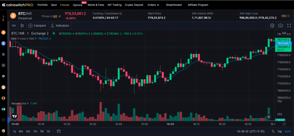
Now speed things up. The Exponential Moving Average (EMA) reacts faster than the SMA because it gives recent prices more weight. Crypto traders love it; the market moves fast, and EMA keeps up.
When Ethereum closes above its 20-day EMA, buyers regain strength. Fall below the 50-day EMA, and sellers start pressing harder. The shorter EMAs, like 9-day or 21-day, flash momentum shifts before your eyes.
Watch when those lines cross; they whisper reversals before candles confirm them. A 9-day EMA crossing above the 21-day EMA is often the first signal that sentiment has flipped. Swing traders watch this like hawks because it shows where conviction enters the chart.
EMAs also act like invisible support lines during uptrends. You’ll often see prices bounce right off them, not magic, but crowd behavior repeating. Compared to SMA, EMA is like a sprinter, quick, reactive, and sometimes overexcited. SMA, on the other hand, is a marathoner, slow, steady, dependable. Smart traders use both.
Read More: Supertrend Indicators: How To Generate Buy & Sell Signals?
Moving Average Convergence Divergence (MACD)
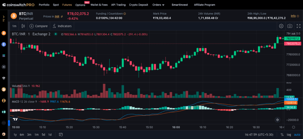
When you combine momentum with direction, you get the MACD, a chart within a chart. It blends two EMAs to show when trends are strengthening or weakening.
You’ll see two lines: the MACD line and the signal line. When the MACD crosses above the signal line, its momentum is gaining speed. When it dips below, the wave is losing power. Then there’s the histogram, those small bars that show how wide or narrow the gap between the two lines is. Bigger bars mean stronger emotion; smaller bars mean quiet before change.
Say Bitcoin hits ₹1,03,00,000, and MACD flips positive with bars growing taller, that’s confidence entering the room. When those bars shrink, momentum cools down before price reacts.
Experienced traders love MACD divergence, when prices rise but MACD doesn’t follow. It’s the market’s way of saying “careful.”
MACD isn’t about perfection; it’s about awareness. It’s how traders know when strength runs deep or when rallies are all noise.
Conclusion
Reading advanced charts isn’t about memorizing terms; it’s about understanding behavior. Candlesticks show the conversation between buyers and sellers. RSI tells you how emotional that conversation is. SMA and EMA draw the path forward, and MACD confirms how strong that path really is.
When you combine them, patterns start speaking. You see, when accumulation begins, when hype peaks, when silence hides opportunity. The same story unfolds across Bitcoin, Ethereum, or even gold. You’re not predicting the future; you’re learning to listen.
Over time, charts stop being intimidating. They start feeling familiar, a visual rhythm that mirrors every trader’s emotion. That’s when you know you’ve moved from guessing to reading.
FAQs
1. Does crypto have candlestick charts?
Yes. Every major crypto platform offers candlestick charts for all tokens. They show price movement visually, helping traders identify trends, reversals, and key support or resistance zones.
2. How to read candlestick charts in crypto?
Focus on body size and wicks. A green candle means buyers won; a red one means sellers took control. Long wicks reveal hesitation, while consecutive candles in one direction suggest strong momentum.
3. Which candle is best for crypto trading?
There’s no “best” candle; context matters. Traders often rely on engulfing, hammer, and doji patterns to gauge reversals. Combined with RSI or EMA signals, they reveal entries with better timing.
4. Which chart is best for crypto?
For most traders, candlestick charts with SMA, EMA, RSI, and MACD overlays give the clearest read on market psychology. They balance detail with direction, making them ideal for day traders and long-term investors alike.e